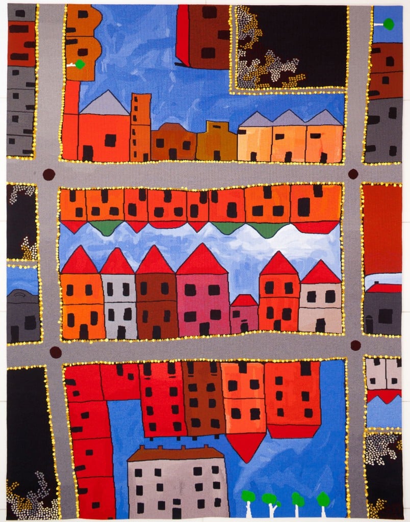
If you’ve ever climbed the stairs to get to the Library’s domed reading room, you might recall seeing a brightly coloured tapestry hanging in the stairwell. Ochre and blue, with gridded streets and buildings. Perhaps you’ve wondered what it represents?
The tapestry is Spring Street End by Indigenous artist Ben McKeown, a descendant of the Wirangu language group off the far west coast of South Australia. To understand the artwork a bit better, we asked for Ben’s take on it:
‘When I was invited by the Library to submit a design for the tapestry under the theme of Memory in Victoria, I decided to focus on the top end of Spring Street. This is because in many ways it is the heart of Victoria; the place that holds the official history and the memory of tomorrow. From the Indigenous history perspective, it’s also where William Barak delivered three petitions to save the Coranderrk Mission after walking all the way from Healesville.
‘The work’s title Spring Street End takes its name from the lone multistorey grey building at the bottom of the tapestry. The other brightly coloured buildings lining the streets represent Melbourne’s dynamic art and cultural scene. These buildings are also intended to remind us that these are places where people have lived, worked and played. All contribute in their own way to the memory in Victoria.
‘This work is layered with many meanings. It plays with the idea of a meeting of cultures which is represented by Indigenous and western viewpoints. I have achieved this by blending birds-eye with streetscape perspectives. The roads signify Hoddle’s grid system but are not as straight and rigid. Instead they have an organic appearance which takes on a unique visual language. Each road is framed by a combination of ochre and fluorescent yellow dots. These have multiple meanings: ochre yellow is a traditional pigment used for thousands of years by Aboriginal people for decoration and ceremony. In this work I have used it to signify the street lights as well as flowering acacias.
‘The colour of the yellow ochre is not the only visual cue for the continual Aboriginal occupation and contribution to the memory in Victoria. I have also used dot iconography within the voids or black areas in the design to represent Indigenous culture, and in particular the mapping of country. Even though this artistic language is not found traditionally in Victoria I have included it to reaffirm my connection to this country and the notion that visitors or guests living in Victoria contribute to its memory.’


Thank you Anna and Ben. A thought provoking insight into the imagery of this marvellous tapestry which draws my eye every time I pass it by.
Thank you, I’ve just been searching for info about this subject for ages and yours is the
greatest I’ve discovered so far. However, what concerning the bottom line?
Are you positive about the source?
Hi, thanks for your comment. This quoted content was written by the artist himself. It originally appeared in our inhouse magazine. Regards, Anna